This 6DF diagram explains the reasons why the coronavirus COVID-19 may turn the USA into a socialistic state.
It is not an accurate prediction but only a description of some possibilities of the future development. This diagram consists of a combination of simple dependencies, and is obvious enough to use it for explanation of basic principles of the Diagrams of Effects.
Note, this diagram describes the state on March 3rd, 2020 when I had drawn it to explain to my son some important forces that may affect the 2020 United States presidential election. To the time you read this the circumstances may change. Bernie Sanders is considered as an alternative to the current US president Donald Trump because of two reasons: He openly declares socialism as his main goal, and all other Democratic candidates are boring.
The new coronavirus COVID-19 has already caused a pandemic which could affect the world economy and may dramatically change the outcome of the 2020 United States presidential election. Let's start the explanations from the direct impact on two important parameters.

Ellipses represent the parameters of a system that is being analyzed. This parameters may change over time. Arrows represent effects when a change of one parameter causes some cause in another parameter.
6DF diagrams are based on Gerald Weinberg's Diagrams of Effects that are described in his books. This is an almost forgotten technique of analysis despite its usefulness. 6DF simplifies the Weinberg's version and introduces some improvements.
From the point of view of synergetics we can consider the model of political life as a complex dynamic system with many internal connections. This means, even a small change of some parameter may not only dramatically affect other parameters but also may change the behavior of the whole system. The 6DF analysis helps to define such dependencies, to clarify the self-organisation principles of this system, to explain its behavior in the past, to predict its future behavior, and to find out the ways to change it.
Let's leave out nontrivial philosophy of synergetics and its tricky equations. I'll only mention that we consider the system as something that produces, transfers and converts information.
The ellipses "Fear of COVID-19", "Donald Trump's Popularity", and "Stock Market Indices" represent parameters of this system. They are quite abstract, but we can with confidence state that they rise or decrease over time. The 6DF diagram explains how this changes affect other parameters.
The Weinberg's diagrams use the computer related term "variable" but the term "parameter" was preferred for 6DF. Note, in almost all cases a parameter could be changed by an external intervention that is not represented on the diagram.
There is only one truly independent variable: time. All parameters in 6DF are by default dependent on time and the analysis must predict how the parameters change over time.
In the contrary of Weinberg's diagrams 6DF does not differentiate between measurable and estimated parameters and do not use cloud shape for the second.
People who like numbers but do not understand them could say that we are able to represent the "Stock Market Indices" as a numerical value but something as abstract as the "Fear of COVID-19" may be only guessed in imprecise descriptive adjectives. This is not correct.
If we say, that a parameter may rise and decrease, we could think out some measurement that represent the changes of the parameter's state in numerical values. Even a fear could be measured by introduction of psychological questionnaires, collection of results in a representative group, and statistical analysis of results.
On the other hand the "Stock Market Indices" may be represented in many ways as one number produced by some addition of selected values of important stock indices or as a vector of numbers for each existing stock index. The art of representation is dependent on the goal and on the usage. Usually there are many independent possibilities that have some advantages and disadvantages. Unfortunately it is not possible to predict which representation would be best for a specific usage we will be needed in the future.
"Donald Trump's Popularity" may be represented as even more complex multidimensional matrix of numbers. The mean value for the US is not enough because each state matters for the presidential election.
Simply speaking, there is a possibility to convert this simple diagram into a scientific research and apply for academic grants by replacing obvious graphical elements and dependencies with tricky mathematical formulas. If we replace "statistics" with "machine learning", "model testing" with "AI", and "spreadsheet" with "big data", the grant sum may rise tenfold.
This all is not interesting in our consideration because the only important outcome is the understanding how the whole system would behave over time and which conditions may affect the process.
I would also repeat, that each parameter represents the state of something complex but the only one information that is important is the change and it could be denoted with two words: "rises" and "decreases". We limit our knowledge with this and do not strive for numbers. Simply speaking, we try to understand principles, abandon numbers, ignore statistical probabilities, and do not play science.
(At least, we would not be forced in the future to explain why the modelled outcomes do not match with reality. The process of explanation of prediction's failure is the main part of every humanitarian science.)
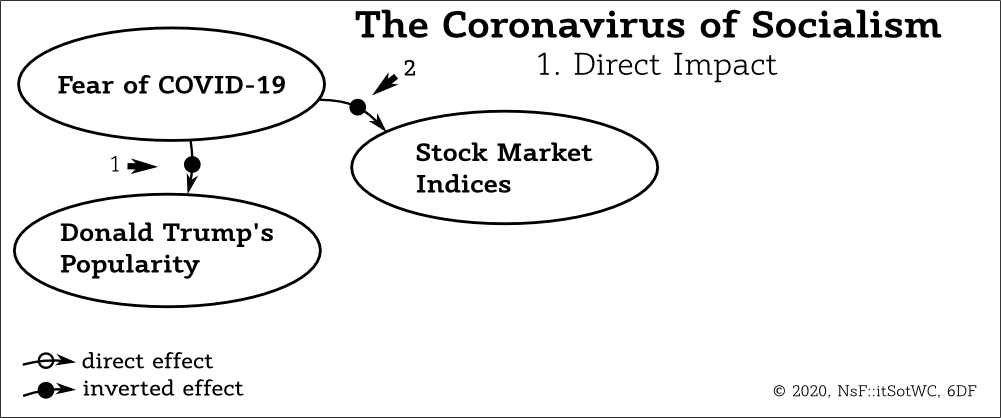
The first step of the diagram's construction considers the direct impact of the parameter "Fear of COVID-19". At this time it rises. It is obvious that this will decrease the "Donald Trump's Popularity" because at least some people are confident that the president of the US is responsible for all big problems. And if the "Fear of COVID-19" will decrease in the future this will lead to increase of the "Donald Trump's Popularity". This dependence is represented on the diagram with the arrow "1".
The change of the source parameter will cause an opposite change in the goal parameter. This effect is called "inverted".
If a change in the source parameter causes a change of the goal parameter in the same direction, the effect is called "direct".
A direct effect is denoted with an empty circle on the arrow and is represented in text with a plus sign: " =>(+)=> "
An inverted effect is denoted with a black circle on the arrow and is represented in text with a minus sign: " =>(-)=> "
The Weinberg's terms "positive" and "negative" are emotionally loaded. Additionally, a direct effect may lead to undesirable results what is emotionally negative, and may cause misunderstandings. The terms "direct" and "inverted" sound more technical.
Thus, the "Fear of COVID-19" produces two inverted effects.
| 1. | "Fear of COVID-19" | =>(-)=> | "Donald Trump's Popularity" | |
| 2. | "Fear of COVID-19" | =>(-)=> | "Stock Market Indices" |
Note, the 6DF considers only the direction of changes. A connection between parameters may be lineal and obvious or it may be described with a complex function. We are not interested in details. It is possible to build mathematical models afterwards but these algorithms are not important for 6DF analysis which investigates only the nature of dependencies.
Let's add an indirect impact.

The arrow 3 shows the direct effect of changes on the "Stock Market Indices":
| 3. | "Stock Market Indices" | =>(+)=> | "Donald Trump's Popularity" |
Note, the parameter "Stock Market Indices" is used here to represent the economic optimism of the country. It rises when the financial sector predicts that the state of the economy will be better than expected and it falls when the financial sector fears that the real outcomes will be worse than the previous predictions. It is possible to replace the parameter "Stock Market Indices" with an abstract parameter the "Fear of Economic Collapse" or something even more poetic.
Simply speaking, the arrow "3" states that the "Donald Trump's Popularity" is dependent on the health of US economy. Good economic conditions and future expectations make the current president more popular and rise the chances in the next election. Bad economic conditions and fears of an economic decline make Trump less popular and avert voters.
From a practical point of view, this means that the "Fear of COVID-19" will affect the "Donald Trump's Popularity" even in case a massive advertising will reduce the power of the direct effect (the arrow "1"). The people may agree that the COVID-19 outbreak is not caused by Trump, and not the Trump's presidency but the new pandemic is a natural disaster, but the "Fear of COVID-19" will nevertheless affect the economy and through it the "Donald Trump's Popularity".
It is important to understand that the effects propagate through system not immediately. The "Fear of COVID-19" causes the changes of economic predictions, this information reaches the people who hold shares, they make their prediction about the future performance and place sell orders, the "Stock Market Indices" start to move. The changes on the stock market affect broad public in many ways and after some time.
There is also some delay between the changes in life conditions and the decision not to vote for the president who has caused this.
This is applicable to any effect on a 6DF diagram, because it means that some information about changes of one parameter was transferred to some other part of the system, than it was processed there what has caused some changes in other parameters. Such chains may be pretty long and the processes in them may be pretty slow, but the exact values of delays are not important. We can assume that all effects propagate not immediately and all changes are slow enough to live out the detailed consideration of their speed.
We do not perceive the whole diagram at one time but focus on some part of it. If our attention switches through parameters in the direction of effect arrows that connect them, this is good enough to get a feeling of the time-based development.
Of course, it is possible to define precise values for delays if there is an interest in developing of a mathematical model for scientific entertainment. However, this is not a good idea because such numbers and functions would be a pure speculation for any kind of somewhat complex real world system. The 6DF diagram helps to understand complex dependencies and this is the only knowledge that matters.
Let's return to the diagram. The direct impact of the "Fear of COVID-19" is bad enough and the indirect addition to the "Donald Trump's Popularity" decline could upset you if you love him. However, things only start to get interesting. The election implies the participation of the second candidate, and he is a socialist. Let's add him to the diagram.

Bernie Sanders is a socialist and this means that his basic postulate is "The capitalism has failed". It is difficult to believe in this in the times when the economy of the country booms and the prosperity of people grows. In the times of an economic decline these words sound more persuasive. This means, we add an inverted effect:
| 4. | "Stock Market Indices" | =>(-)=> | "Bernie Sanders's Popularity" |
You can imagine the current diagram state as a weighing scale. When the "Stock Market Indices" rise the "Donald Trump's Popularity" also will rise and the "Bernie Sanders's Popularity" will decrease. The chances for Trump to win the second term improve.
When the "Stock Market Indices" fall the "Donald Trump's Popularity" also will fail and the "Bernie Sanders's Popularity" will rise. This makes it possible for the next US president to be a socialist.
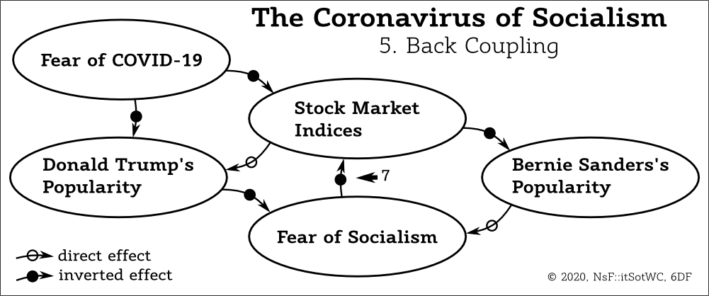
We add these expectations in our diagram as an abstract parameter. It is convenient to our purposes to consider it as an induced fear in the financial sector.The effects "5" and "6" are obvious. The "Donald Trump's Popularity" decreases this fear and "Bernie Sanders's Popularity" causes it to grow.
| 5. | "Donald Trump's Popularity" | =>(-)=> | "Fear of Socialism" | |
| 6. | "Bernie Sanders's Popularity" | =>(+)=> | "Fear of Socialism" |
Our diagram is almost complete. The financial sector and rich people know that they would be stripped of money from the moment Bernie Sanders enters the presidential office. Their fear is not an abstract feeling. It commands them to handle.
The best strategy by introduction of socialism is to sell everything valuable, move the money abroad where they would be behind reach of the socialistic government and convert them into something what could withstand the economic collapse of the country of exodus and the following collapse of its currency. (I would suggest the Chinese renminbi. Maybe this is not the best option, but the Communist Party of China values the health of the national economy and would preserve capitalistic values.)
Thus, the "Fear of Socialism" causes real economic changes. We add the last effect in the diagram as the reaction of the "Stock Market Indices" on the "Fear of Socialism".

This is the inverted effect "7" and it creates a back coupling:
| 7. | "Fear of Socialism" | =>(-)=> | "Stock Market Indices" | |
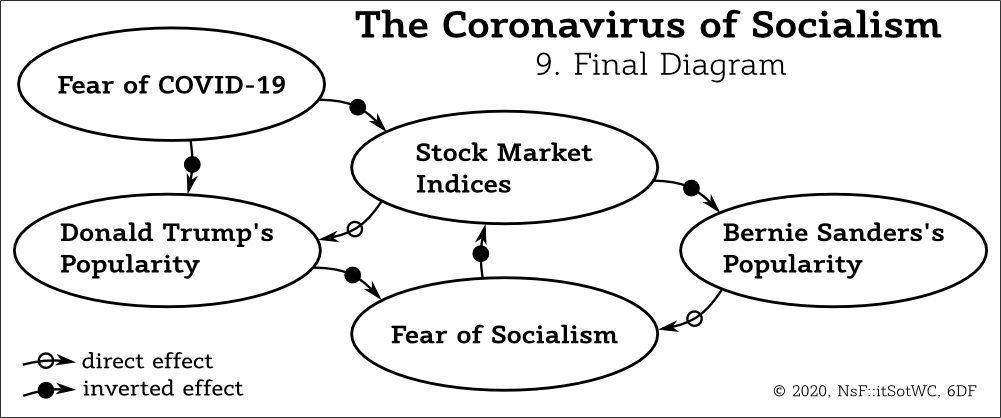
The model is complete. Let's play with it.
First important step after completion of a 6DF diagram is the trend analysis. I usually use the convenient "+" and "-" signs but this time let's use the north-east arrow " ↗ " to show that a parameter rises over time and south-east arrow " ↘ " to show that it decreases.
The names of effects are not important and I usually draw a copy of the 6DF diagram with empty ellipses. Only the effects and dependencies are used on this stage. The original diagram is placed nearby and can anytime be used for references.
Let's consider effects of the rise of the "Fear of COVID-19". We place the arrow directed up " ↗ " in the correspondent ellipse and then follow the arrows of effects and draw an arrow in the same direction for a direct effect, and in an arrow that represents an opposite direction for an inverted effect.

This is a simple case without conflicts and the order of trend analysis is not important. All paths through this diagram produce the same image.
This diagram confirms that the rise of the "Fear of COVID-19" will decrease the "Donald Trump's Popularity" with the "Stock Market Indices" and will rise the "Bernie Sanders's Popularity" with the "Fear of Socialism".
Of course, these dependencies are quite obvious in this simple case. The 6DF diagram allows to represent them more clearly but this is only the first benefit. Let's start the analysis of cycles.

The first is the cycle "8". The rise of the "Fear of COVID-19" starts the cycle of the "Donald Trump's Popularity" decline:
| 8. | "Donald Trump's Popularity" | ↘ => ↗ | "Fear of Socialism" | ↗ => ↘ | "Stock Market Indices" | ↘ => ↘ | "Donald Trump's Popularity" |
The chain of effects is obvious and I would not repeat it as a detailed explanation. Remember that all effects have some delays. We go through the chain of effects from left to right and then return to the "Donald Trump's Popularity", and repeat the cycle. Each time the "Fear of Socialism" grows a bit, the "Stock Market Indices" a bit decreases and the "Donald Trump's Popularity" decreases which also starts the new iteration through this cycle and increases the cumulative changes.
The speed of the cycle may be quite slow but the stock market is usually nervous and it can happen in one big landslide.
Simultaneously the Bernie Sanders's cycle starts to spin in the opposite direction.

The cycle "9" is also simple. For convenience, let's start the consideration of the chain of effects from the decrease of the "Stock Market Indices":
| 9. | "Stock Market Indices" | ↘ => ↗ | "Bernie Sanders's Popularity" | ↗ => ↗ | "Fear of Socialism" | ↗ => ↘ | "Stock Market Indices" |
It seems, the delay between the decrease of the "Stock Market Indices" and the rise of the "Bernie Sanders's Popularity" is quite long. The people who could support him do not understand how the economy works. They will feel the effects only when the results of the stock market crash will propagate to their level. This allows to hope that this cycle will be much slower than the Donald Trump's Cycle. However, this does not change the main conclusion:
The impact of the "Fear of COVID-19" can start the processes that will automatically lead to the triumph of a socialist candidate in the 2020 US election.The diagram shows how this would happen.
This is the bad news. The good news is that you now understand the simplest case of a 6DF diagram.
Two words about the results of analysis.

It is useful to draw trends, chains of effects and cycles, however, I recommend keeping the final version of a 6DF diagram clean. It is more useful to make a set of copies with ellipses without texts and to use them for exploration of different kinds of effect propagation. Each new question may be answered with some different set of additional graphical elements and an attempt to draw them each time over the same diagram will cause a visual clatter. The right way is to minimize the cognitive load and to make each time a simplified copy of the main diagram. This saves time on the long run and reduces the amount of errors.
A more advanced version of a 6DF diagram will be present in the next chapter.
